This client always has the best images.

This client always has the best images.
Always exciting to get a new client! I love word-of-mouth! 🙂

This job was turned around in 48 hours. It was based on an old and out of date version of itself. I think I breathed a little life into it.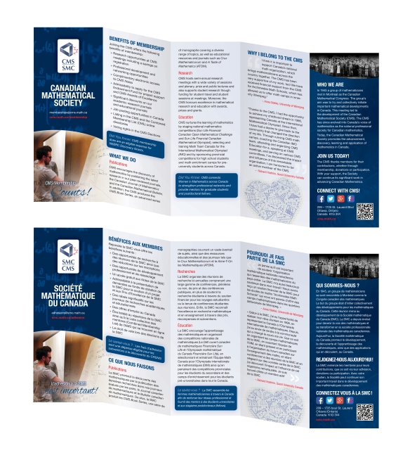
Yes, I have a lot of music teachers in my life. They are all fantastic and deserve to have equally fantastic design to represent them. This is a before (MS Word, see bottom) and after (me) project.


Here is an example of simple and elegant. I designed them for a Kingston area piano teacher.

As always I am very thankful for every client that is impressed enough with my work to give me a call. I am usually the first to say, “the bigger the challenge, the more fun for me!” As a graphic designer you get used to the same-old-same on a project-by-project basis it really is exciting when a new challenge comes my way.
That said, my most recent challenge was with the Canadian Mathematics Society’s Newsletter. They are, as you probably guessed, pretty keen on math. They share their research, findings, and math news in a bi-monthly newsletter. So, naturally, there’s a lot of Omega’s (Ω) and Psi’s (ψ) and everything else you can imagine! (φ ψ ∞ ⊂ ∪ ∞ ≠ π ∑ Δ ƒ Ω ∫ μ π θ ω λ)
As I said, I have ho problem with challenges. The only problem, for me, is they’re not all in the same font! Most can be found in the system font, Symbol. The rest are buried and hidden in one of about 15 different math fonts. Things like larger parentheses and this thing -> ∑ in a reasonable weight for large use are very hard to find.
See below:

For the designer’s reading this I know you’re saying “Stop whining, set your style sheets, and go!” So, yes, for the basic variables an italicized Times New Roman character will do. I also have a style set for the Symbol and a style set for the outlined letters. The equations I do manually but that’s no big deal, right? Wrong! The math program used to write these documents can only export to PDF. And, as we all know, when a PDF has a foreign font used it does not release the character in a copy/paste situation. The PDFs also do not import into Illustrator correctly either. So, I’m left with copying and pasting what I can and, character by character, placing each character manually. I feel like a type-setter before the computer-age.
To wrap it up, when all was said and done the client said “The math looks really good!” I’m also being paid for my time. I guess I wanted additional recognition for how time consuming and hard it is to produce beautiful math! Long story short, I’m awesome!
")

This is a great before and after because the before logo is not a bad logo. It’s recognizable and punchy! Unfortunately, the reason it’s recognizable and punchy is because it’s stolen. This client is proof that trademark infringement will not be tolerated, even if you’re not in the same industry.
Can you guess who’s trademark their trademark was infringing upon?
BEFORE

AFTER
![]()


I had found these in an old “portfolio” folder and thought I’d post them for good measure.
